This case study was written by Martina Turjak [mentored by Peter Mullen] as a part of our UX Tree Mentorship Program
Overview
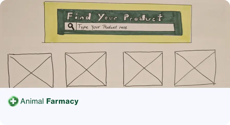
E-commerce websites often struggle to provide accessible navigation and intuitive search tools, especially for older users. The Animal Farmacy homepage suffered from a lack of search functionality, poorly structured product categories, and a lack of visible, user-friendly navigation options. These problems created frustration among users, especially older farmers with limited digital knowledge, and prevented fast and efficient product discovery.
This project is focused on redesigning the homepage to prioritise accessibility, intuitive navigation, and user-centric search functionality.
Problem Statement: How might we make the search and navigation tools more intuitive and visible, so that older users, particularly farmers, can easily and confidently find specific products without frustration or confusion?
Background
This case study is based on a real-world project where the client requested that I improve the user experience of their e-commerce platform. With an average user demographic of farmers aged 57+, the challenges included:
- Difficulty in locating specific products due to unclear navigation.
- Ineffective use of search functionality tools, resulting in user frustration.
- Poor alignment with accessibility standards, limiting usability for older users.
📖 Read the entire “Animal Farmacy Homepage Clarity Improvement” case study