Redesigning the eFlow Toll Payment Process

This case study was written by Dylan Reilly [mentored by Eoin Smith]
Overview
This project focuses on the redesign of the M50 toll payment process on the eFlow website. As a user of the eFlow website, I find that the process of making a once-off toll payment is frustrating and time-consuming, creating a negative user experience. A recent redesign of the desktop and mobile websites has seen a significant decrease in the usability of the service and created an environment that is difficult to navigate and understand as a user.
This project uses a variety of research and design techniques to build an understanding of the primary users of the eFlow website. My goals for this project were to:
- Develop a new and improved payment process that creates a quick and easy way to make a toll payment
- Redevelop user interface and site architecture
- Improve accessibility for extreme users (ie. visual impairments)
Introduction
The eFlow website is used by thousands of motorists each day to pay their M50 tolls and access their accounts. A recent update to the company’s system has removed the once-popular toll payment app from the service, driving users to the desktop and mobile sites instead. As the primary method of paying tolls, the website provides an essential service to motorists who use the M50.
The goal of the eFlow website is to provide a payment system for drivers to pay for their trips across the M50 toll bridge in Dublin. It also provides a system for paying fines incurred by missed tolls and provides users with the opportunity to create and manage a tag-tolling account for faster journeys across other toll roads in Ireland.
This project aims to develop a new toll payment system for the eFlow desktop website, reducing the number of snags and pain points experienced by users. This project will also see the development of an updated user interface for the entire site, as well as the recreation and addition of visual assets.
Design Process
This project will make use of the Double Diamond Design Model. This model was developed by the British Design Council in 2005. It contains 4 stages: Discovery, Definition, Development, and Delivery. These stages work as a basic roadmap to guide designers on a journey to develop the most successful user interface. The double diamond represents an iterative process, meaning that each stage can be revisited, improved and iterated upon as the design process continues.

Phase 1: Discover
The discover phase refers to the research process that establishes the need for a new design system. It analyses current users, existing systems and quantitative data that lays out issues that need to be solved as well as possible solutions. The discover phase presents the designer with the chance to reach out to target users and gather their thoughts regarding the current user experience. It is important to gather as much information as possible during this phase to maximise the context of understanding about the user’s problems.
Who uses eFlow?
There were 54.9 million trips made on the M50 in 2019 (TII.ie, 2020). 36.8 million trips were paid for using electronic transactions, e.g. the toll tag. This indicates that 18.1 million trips were paid for manually, using the app (now discontinued), Payzone outlets, and the M50 eFlow website payment portal. This large user group could benefit greatly from a centralised payment portal on the eFlow website. The M50 Quick Pay App was discontinued in 2020 and has not yet been replaced. This means that in order to manually pay a toll users must interact with the eFlow website. The toll tag service provides an automatic payment system, however, it comes with a monthly fee which means it is only beneficial to those who make multiple journeys per week.

As-Is analysis
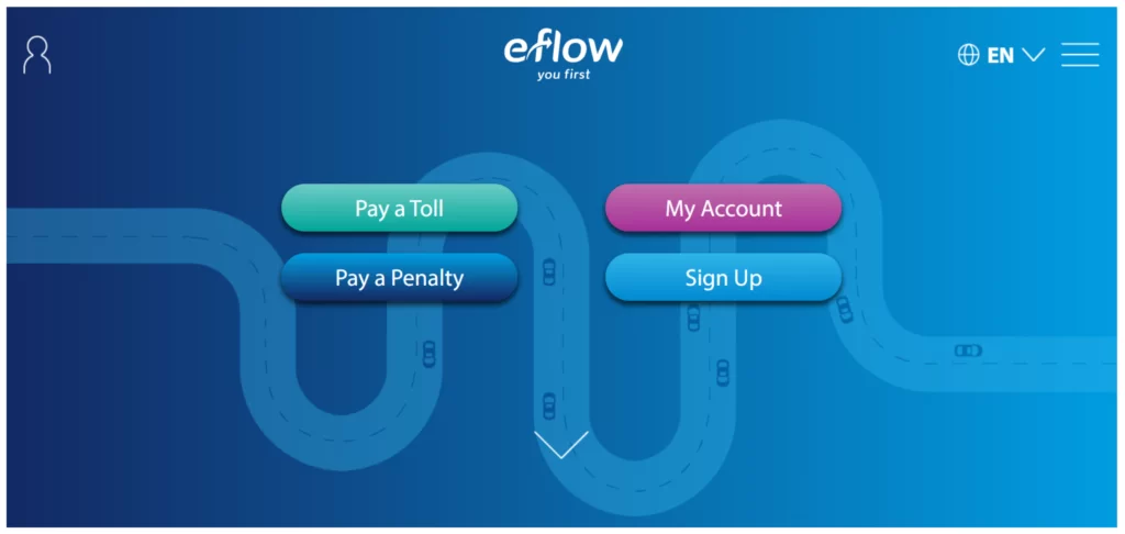
The current site appears outdated in its design. Spacing issues leave large areas of valuable screen area without content and when resized, content does not align properly. The gradient-heavy splash screen features four small tabs with sizing and spacing issues and no iconography to accompany them. There is a lack of content hierarchy, for example, ‘Create Account’ appears on the homepage even though this button would likely only be used once…
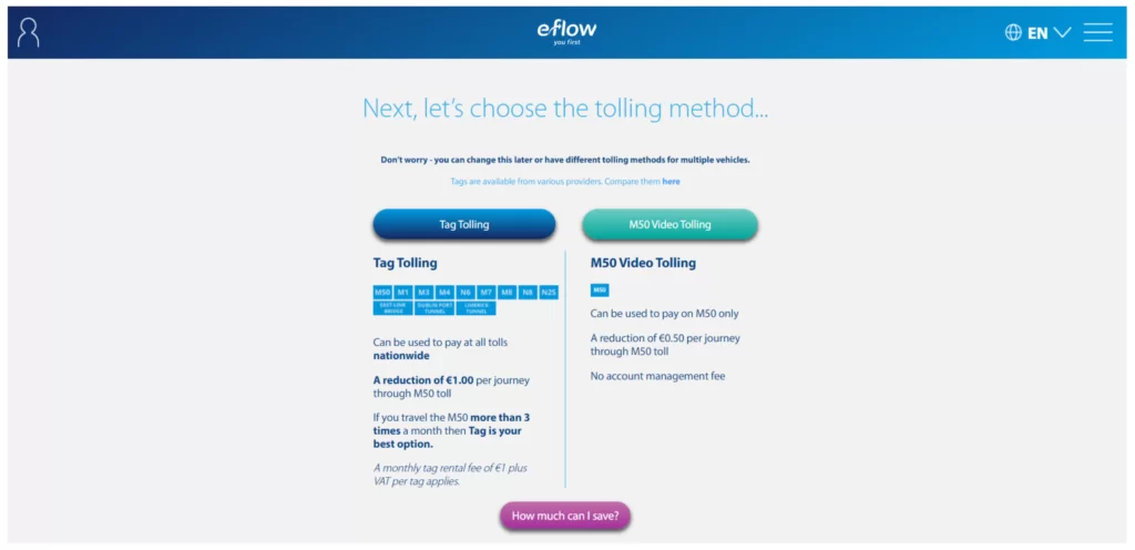
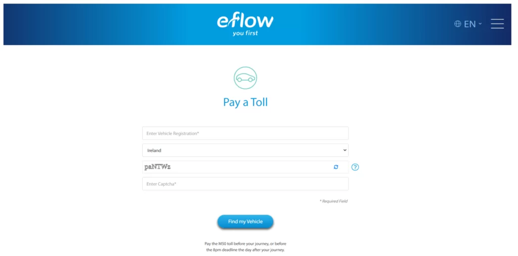
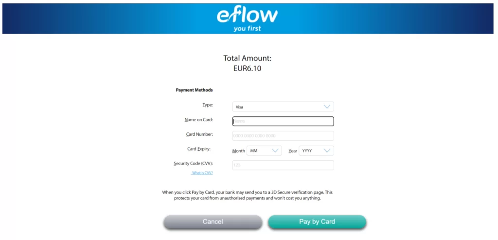
The payment process is slow and arduous, presenting multiple pain points. Examples of these screens can be seen below.
Survey
The first user interaction took the form of a survey. This was conducted with existing eFlow users ranging in age and demographics. The survey was anonymous and focused mainly on gaining quantitative results. I gathered responses to the survey questions from six volunteers who provided detailed quantitative feedback. Participants of both the surveys and interviews were granted full anonymity during this exercise.
Post survey interviews were carried out with two members of this group. The survey was unscripted and focused on drawing more details from the participants regarding certain information they had provided. The following items were the most notable points uncovered from this process:
- 60% of users utilised the desktop site as their preferred way of paying tolls – this was surprising as it would be assumed that mobile would be the most preferential system.
- 20% of those surveyed were weekly users of the eFlow site, while 60% utilised the system a few times per month. Further research uncovered that there were few daily users as the pandemic had reduced the need for people to travel to work as often.
- 40% of users had never received a fine for a missed payment.
- Most users indicated problems with the payment system. The most common issue appeared to be that the process was too cluttered and took too long to navigate.
Problem statement
The problem statement identifies the central issues with the existing system and defines the problem to be solved in a succinct question. This problem statement frames the research and functionality requirements necessary to resolve during the project.
“How might we streamline the toll payment user process of the eFlow website to create a more efficient system that benefits users?”
Competitor analysis
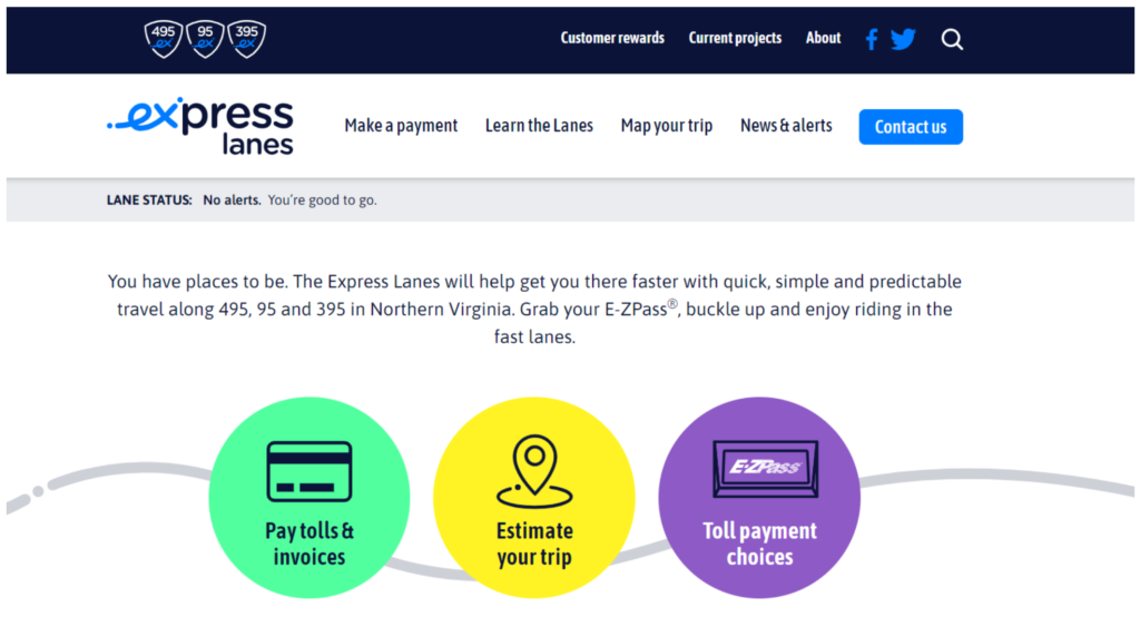
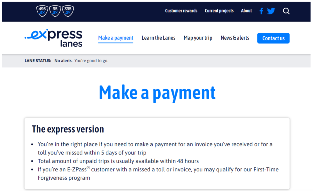
Competitor 1 – Express Lanes (USA)
Pros:
- Very clean interface.
- Linear content flow
- Card system breaks up information
- Navigation system
Cons:
- Text-heavy
- Very few images or icons
- Splash screen lacks remarkable content
- Home screen content could be reordered
- The first impression is confusing
The system implemented by Express Lanes, a toll system based in the USA, provides the user with a streamlined system to quickly register a vehicle and pay a toll in a few short steps. However, the site lacks visual content such as pictures and images. It remains quite text-heavy. In my opinion, the streamlined process, combined with a visual system would create a user-friendly system incorporating both form and function.
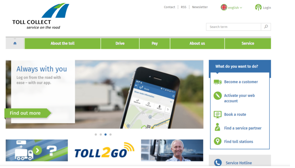
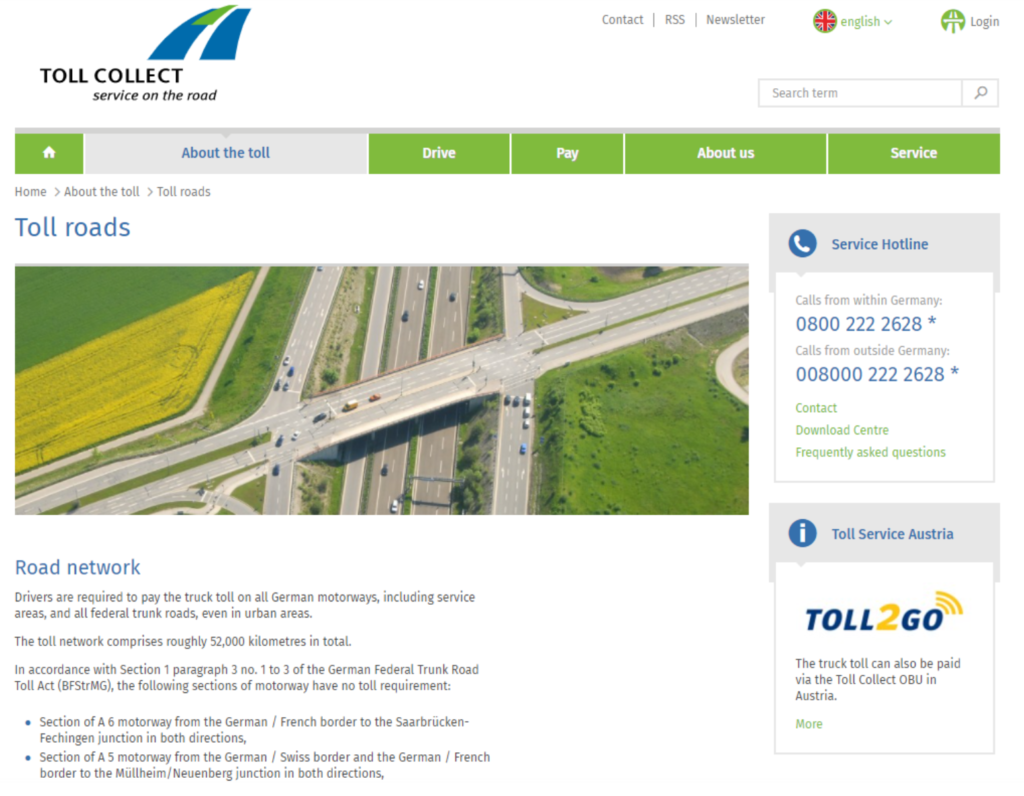
Competitor 2 – Toll Collect (Germany)
Pros:
- Splash screen introduces content nicely
- Lots of imagery links to main products/services
Cons:
- Dated design
- Sizing of elements
- Content spacing
- Misuse of white space
- Navigation bar sizes with a combination of text and imagery
Toll Collect, operated in Germany, showcases how some design elements can create a difficult system to use and navigate. The desktop navigation bar lacks consistency, in both colour, size and content. The site feels outdated in general. The site does provide detailed information on emission standards, vehicle classes and variable toll rates throughout the payment process. The utilitarian feel of the site incorporates a large amount of content without a coherent visual style. It is evident that this site is geared towards industrial customers and not the general user. The site lacks a clear button interface within the content and relies heavily on text. In my opinion, this site represents how designing a toll system for the general consumer can become overloaded while trying to serve too many functions.
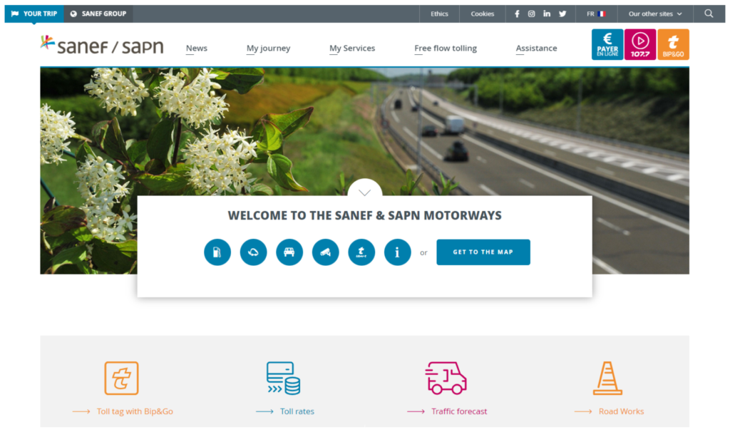
Competitor 3 – Sanef (France)
Pros:
- Use of iconography
- The navigation system on the home screen
- Journey planner as well as toll payment
- The colour scheme / visual system promotes important content
Cons:
- Relies on icons with no text in places
- Slightly overwhelming amount of content on the home screen
- Content could be reordered
Sanef, a French toll payment system, utilises a clean visual system with colour coded information, iconography and visual hierarchy. The site offers a wide range of features, including traffic information, radio services and mapping systems. The navigation bar utilises iconography as its main medium for displaying information, which can be confusing as a first time user. However, this system displays a vast amount of information in a small space without feeling too condensed. The site feels coherent and well-spaced. The card system delineates content well. It appears well organised and accessible to the general consumer.
Phase 2: Define
The define stage prioritises the organisation and filtering of the information gathered during the discover phase. This helps the designer to synthesise the scope of the project in further detail. It also allows the designer to elaborate on the findings they have previously concluded and develop a structure that visualises the information concisely. The end result of the define phase should clearly set out the problems that must be solved and establish how the proposed system will eliminate these issues.
Opportunities:
- Redesign a new payment system
- Update website UI
- Improve navigation
- Improve accessibility – icons, colours, micro-interactions, heuristics
Feature Prioritisation Matrix
The feature Prioritisation Matrix sets out the basic functionality and features of the site and indicates how integral each element is to the user experience while balancing them against the effort it would take to implement them in real life. In the case of this prototype, the elements related to the payment system and user account are considered to be the backbone of the site’s functionality. In the world of programming, these features would be relatively straightforward to implement, meaning that the overall design changes to the site are likely to be achievable.

Personas
The user personas ask the question; “Who are we designing this product for?” Personas are an excellent tool to help designers empathise with their users. They were designed based on early user research that gave an indication of who would be using the service and why. The personas presented below showcase the needs and wants of a power user, to represent the everyday user with a knowledge of how the system works, as well as a secondary user who may be less tech-savvy than their counterpart.


Empathy map
The empathy map draws on information gathered during the research phase to empathise with the hypothetical user and determine how they will think and feel as they interact with the product. In this case, the empathy map demonstrates the frustrations that can arise using the existing eFlow system and point out the needs and insights of the user. It was developed with the users from the personas in mind. The diagram shows what they are looking for and how some may find it more difficult than others to access certain features.

Journey map
The journey map identifies the task flow of the user as they navigate the site from A to B. It sets out the scenario of the user and presents their expectations from the site functionality. This data references the research collected during the first stage of the project. This diagram showcases where the progress of the user can become disrupted by pain points in the design and demonstrates how the user’s feelings are affected by their progress. For example, the diagram illustrates how disruptions caused by the journey selection and vehicle identification screens can create a negative impression for the user.

Site Architecture & User Flow
The user flow establishes the path of the user as they navigate through each process. The flow is broken down into actions and decisions that influence the user’s path through the site. In this case, paying a toll and paying a fine take the most prominence in the design and indicate the most time and attention required by the user.

Phase 3: Develop
The development phase is the beginning of the visual design of the prototype. It starts with the development of a low-fidelity version that establishes the basic visual design and information architecture, eventually leading to the development of the high-fidelity prototype. This phase of the project utilises a lot of multi-disciplinary work, such as user interface design and improvements to the user flow. Continuous testing of the prototypes throughout the development phase allows designers to solve problems and fix issues as they occur.
Paper Prototype and Low-Fidelity Mockup
The paper prototype and low-fidelity mockup were developed to visually identify the information architecture and user task-flows. These early prototypes identify some of the major pain points from the existing site as discovered during early user research.

Design Guidelines
The high-fidelity prototype incorporates the colour scheme from the existing eFlow website. This was done to maintain a sense of familiarity with the existing brand guidelines, while also maintaining a contrasting and complementary palette of colours. The primary font, Open-Sans, was paired with Montserrat as both worked well as part of an accessible and modern design system.

Accessibility
The main colours and types used in the high-fidelity mockup were tested using accessibility tools to determine whether they would present any issues to users with visual impairments. I was particularly interested to see whether the colour scheme would present issues to users suffering from tritanopia (blue-green colour blindness) as the eFlow brand uses shades of blue across all touch points. The following results indicate a contrast score of 11.28, indicating that the colours perform well with both small and large text.

High Fidelity Prototype
The high-fidelity prototype was developed using Figma. As mentioned previously, the prototype focuses on the two main user journeys identified during the research phase; Paying a toll and paying a fine. The prototype also integrates the main navigation bar that showcases links to some of the central pages on the existing webpage, as well as a ‘My Journeys’ tab that some users showed interest in. A ‘hot-jar’ button is fixed in position on the right side of the screen. This offers users the opportunity to access a ‘quick-pay’ tab that allows them to pay a toll without having to navigate away from the homepage. The homepage also presents animated content developed in Adobe After Effects to showcase the automatic payment process in a more exciting way.

The toll payment and fine payment systems utilise a card-based UI that opens within the homepage, rather than on a completely new page. The system is broken up by breadcrumbs that also illustrate the payment process to the user. The navigation is maintained by a ‘back’ button to return to the previous step, a ‘restart’ button that restarts the payment process completely and a simple ‘x’ button to close the window altogether. The designs of these buttons are based on existing heuristic patterns to enable the user to interact with them accordingly and feel familiar with the design, even as a first time user.

Phase 4: Deliver
The final stage of the double diamond model is the delivery phase. This includes user testing of the high-fidelity prototype and signing off on finalised features once they have been analysed. Testing can be carried out on a number of elements of the prototype with a variety of participants. The feedback received from participants during this phase is important as it contributes to the final output of the product. Testing can continue even after the prototype is released as there is always room for continuous improvements to the design.
User Testing and validation
User testing was conducted with 4 volunteer users. Testing was conducted with a combination of in-person and online testing. The volunteer group was made up of two males and two females of varying ages and technical abilities. The users were presented with 4 main tasks to complete and their progress was monitored as they undertook each step. Users were asked to explain what they thought would happen at certain interactions and given the chance to share their opinion on the design and overall look and feel of the site design.
The results of the tests provided an optimistic view of the prototype’s potential. Users performed well with all tasks and highlighted usability challenges and pain points that had not been previously considered. Each test laid out several changes that could be made to the design and the prototype became more user friendly with each iteration.

The positive and negative feedback from each user was noted in the results section. Users were asked to provide a score for the prototype based on their experience. The prototype achieved an average usability score of 76.25% when combining the scores of the four user tests.

System Usability Scale
Testing with the System Usability Scale, developed by John Brooke in 1986, was also implemented during the prototyping phase. The SUS is made up of a ten-item questionnaire with five response options ranging from ‘strongly agree’ to ‘strongly disagree’. The SUS is useful because it is easy to implement and can be used to gauge the opinions of small sample sizes accurately. The scoring system is somewhat complicated, but the results also allow the administrator to evaluate user systems to an accurate degree. The questions are clearly defined and allow an easy way for participants to interpret their feelings about the prototype. The score compiled at the end of the SUS test indicates an average score of how usable the system is.
The following image indicates the scores of users undertaking the eFlow usability test. In all cases, the users returned scores ranging between 60 and 70, which is deemed successful for an early prototype but indicates that there is still potential work that can be done to improve the design even further.

Conclusion
Working on this project was extremely rewarding and provided me with a useful opportunity to develop my skills as a UX designer. The final prototype worked well and demonstrated a successful application of the user needs that were identified during the research phase.
The project also provided me with an opportunity to use Figma for the first time. Understanding this software provides me with the knowledge necessary to be a more practical and efficient designer. I welcomed the opportunity to utilise software like Illustrator and After Effects to apply my illustration and animation skills to this project.
Given the chance to further develop this project, I would like to implement a fully functional prototype that utilises all of the features to create a fully interactive user interface. I would also like to develop a mobile prototype that showcases how the design could be implemented to work on a handheld device. The prototype could benefit from further testing to address any other potential pain points, although I am confident as a designer that most usability issues have been resolved and the prototype is functional. Given the chance to test the product again, I would prefer to implement guerilla testing and work with random participants. This would eliminate any potential bias caused by testing with family and friends.
This project aimed to redesign the eFlow payment process to create a more streamlined and user-friendly experience for those using the desktop site. The design goal was to design, prototype and test an updated payment functionality and determine whether this system. I am confident that these goals have been achieved and this updated payment system serves its purpose as intended while staying true to the eFlow brand. I am especially grateful to UX Tree and my mentor for providing me with the opportunity to develop my skills as a UX designer and produce a prototype that I am proud of.
Link to Figma Mockup
Valentina
Valentina is the founder of UX Tree and a Design Manager at Vhi, bringing over a decade of hands-on UX experience. She holds a master’s degree in User Experience from IADT and is passionate about mentoring emerging designers, with a strong focus on strategic thinking.
